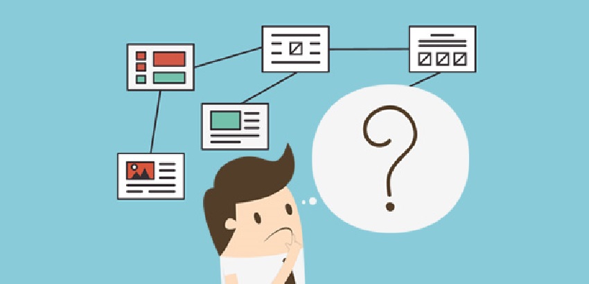
So, you opened a website for your business. You either paid someone to develop and design it for you, or if you’re technically minded, you might have done it yourself. You poured your heart and soul into it, and you were really happy with the end result. Then you put it online, and waited for the orders and communication to come rolling in. And then you waited some more. And then you waited a little longer. And now you’re still waiting. Where is everybody? Why aren’t they using your beautiful new site?
The answer is probably one or two of a number of common mistakes people make when putting a new website together. They’re not major issues, but they’re enough to put a savvy web browser off. Help is at hand though, and it’s right here. Here are the most common things that people hate about websites, and why they’re hated. Where possible, we’ll also tell you how to set things right.
- It Isn’t Mobile Optimized
This is probably the most common issue people don’t think about. Nobody designs their website on a mobile device, and so it can be easy to forget to check it works properly on one either. You may only get around to performing that check when it’s already online, and even if it doesn’t look perfect, you may be inclined to think ‘close enough,’ and leave it. That’s a huge mistake.
The times are changing when it comes to how people access the internet. Half of all web browsing now takes place on mobile devices. If your site doesn’t display correctly on a phone, you’re losing half of your potential customers. That means that if you’re working on a statistical model based on converting a certain percentage of visitors to your website into sales, you’ve done yourself an enormous disservice. Do whatever needs to be done to make it work on mobiles, and consider taking it offline until it’s ready. No impression is better than a bad impression.
- It’s Too Slow
We’re used to getting things in the here and now when we want them. Nobody likes to wait for anything, and with services becoming increasingly digital, we no longer have to. You can order your shopping from a store and have it delivered within an hour without having to leave the house. Digital goods arrive as soon as you’ve paid for them. In the era of super-fast internet connectivity, websites are expected to load within three seconds. Any more than that, and people will leave your page.
Don’t believe us? Then trust Amazon. As the largest internet retailer in the world, small statistics matter to the American giant. They’ve conducted extensive research and discovered that they would lose over one and a half billion dollars per year if their site took just one more second to load on average. Look at Amazon’s website. It’s not bloated, and it’s not full of bandwidth-sapping elements or coding. It’s as minimalistic as possible. That’s what you’re aiming for. Less flash, more dash.
- It’s Impersonal
Unless you’ve found your way into an incredibly niche industry, chances are you’re not the only person in the world who does your job, or works in your field. You’ll be one of many – maybe even thousands – who offer the same service, and are competing the same customers. Your products and services are probably quite similar to your competitors. What’s the one thing that’s wholly different between you and them? You are. And yet people always forget that when it comes to web design.
People genuinely do read the ‘About Us’ page of websites, and what you put on it matters. Don’t use jargon. Don’t just reel off qualifications. Don’t use a remote picture of yourself or your team. If you don’t come across as approachable on this page, you won’t be approached. Be warm. Be inviting. Use language that you’d use if you were talking to someone face to face. Give your visitors a flavor of who you are, as well as what you do. People buy into people more than they buy into products.
- Your Layout Is Nonsensical
Three words: Call To Action. Every piece of content on your site should have a purpose, and there should be a clear direction to follow when a new visitor arrives. The information they’re most likely to have come looking for should either be the first thing they see, or it should be obvious where to find it within seconds of arriving on your site. Them seeing the product is more important than you telling them about the product before showing it to them. They’ll happily go looking for extra information once they’re sure you have what they need.
If your website is vague or non-specific, or your products and services aren’t either on or directly linked to your home page, you’ve prioritized the mapping of your site incorrectly. Finding your way around a website for the first time should be a straight line, not a maze! Look at a good slots website for inspiration, as they rarely get this wrong. There will be detail about who the site belongs to, what incentives they offer and how they go about their business, but the overwhelming majority of visitors just want to see that they’ve got good slot games. When they’ve confirmed that, they’ll find out how to play them. Your homepage is, almost literally, a shop window. Treat it like one.
- Things Keep Popping Up
We thought we’d got rid of pop up adverts on the internet, but now they seem to be worse than ever. All your visitors want to do is log on to your site and quickly assess whether you can provide what they want. That shouldn’t be difficult, but too many websites seem determined to make sure that it is.
Picture this scenario: You log onto a website, and a pop up tells you about cookies and data protection requirements. You accept or reject it, and it goes away. Before you get chance to look at the content, a second pop up appears complaining about your use of an ad-blocker (spoiler: everyone uses ad-blockers now). You dismiss it. Now, a third pop-up appears asking permission to send you notifications. Has it happened to you? Have you left a website because of it, without reading the content you came to look at? We have, and if your site operates like this, so have your potential customers.
Don’t feel disheartened if you’ve made one of the errors listed above; they’re common, and that’s why it’s easy for us to list them. Now’s the time to put them right, though. Your website can be an excellent conversion tool for your business, so long as you allow it to be.